Example Data Insights
In this example, we demonstrate the power of an automated ETL process:
- Extract: Using Python for web scraping, we gather import and export data from 2020 to 2023 across 97 product categories.
- Transform: The extracted data is cleaned and formatted to ensure accuracy and usability.
- Load: The transformed data is then loaded locally or to the cloud for visualization.
What typically takes weeks can be accomplished in just a few hours with the right tools, like Python, significantly streamlining the process.
Power BI Visualization Benefits.
Our Power BI dashboard showcases Spain’s imports and exports for 246 countries and 98 products from 2020 to 2023. The key features include:
1. Map with Bubbles: Displays trade volumes per country. Slicers for imports/exports and years.
2. Tree Map: Shows trade breakdown by country and product. Slicers for imports/exports, years, and countries.
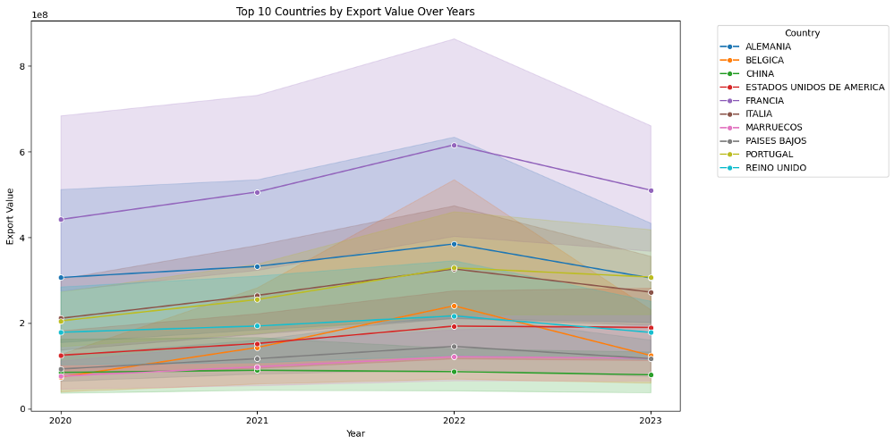
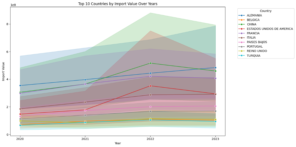
3. Line Chart: Trends for top 20 countries over the years. Slicers for imports/exports and countries.
4. Bar Chart: Trade values for each product. Slicers for imports/exports, years, and countries.
Advantages:
– Interactivity: Slice and dice data with filters.
– Visualization: Clear, comprehensive visuals.
– Ease of Use: Intuitive interface.
Power BI turns raw data into actionable insights, enhancing decision-making and strategic planning.


